
Design Problems week 3
- Sara Gravemaker
- Feb 21, 2017
- 4 min read
Design problems Figure and Ground:
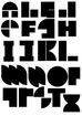
Design Problem 1:
When one looks at letters they usually don't pay much attention to the negative space of the letters. However, by zooming in and sectioning off parts of the letters as we have done here; you get the chance to create new and interesting compositions, which you would not normally expect. What is usually left out or usually falls to the background, can suddenly become the limelight of the composition. It shows the "constructive necessity" (Graphic Design: the New Basics) of the negative space.

Design Problem 2:
In the example below, we used three different colours in order to signal difference between figure (red), ground (green), and background (orange). It showed us how to balance the three elements and still convey the message one wants (though in my case just random letters, not really a message). I used these colours because I thought they complemented each other as well as contrasted, making the separation between figure and ground clearer. I did not utilise the negative space of the letters as much as I could have, because I did not create both letters in red as well as in orange as they did in the example. (Although you can perceive some letters in the orange, "s" and "j" for example, which is purely coincidental, but does show how you can utilise said negative space.)

Design problems Framing:

Each of these logo's is framed in a different way, some of the framing is wider than others. By making the grame wider it emphasizes the picture and by making it narrower, the content appears to grow in size. They "provide a protective frame around the contents" (Graphic Design: The New Basics). In certain cases, I let the image bleed off the badge (see the two first logos with the stags), doing this the image appears more active. In the third one with the stag I also let the text bleed of from the picture, making it more visually interesting.
Design problems Hierarchy:

Design Problem 1:
In this task we were asked to use different variations of hierarchy to emphasise certain bits of text. In the example to the left I used different kinds of hierarchy to find out what worked and what worked less. In the first bit of text, I just moved the more important information flush right and added space between it an the rest of the content of the text. Although it did separate the two it did not do much to emphasise the title specifically. In the second bit, I centred the text and used a bold typeface to emphasise it. However it still didn't leave too much of an impression on me. Then with the third example I used colour to spruce it up a bit, and that already helped a bit. Then finally in the end I found out that combining all those factors, so colour, a larger bold typeface, and a different position from the rest of the text, worked best in order to emphasise the text. However, of course, it is still imperative to consider what the text is for, it could be less appropriate in some situations to emphasise text in such away, than it is in other situations. Style and goal has to be considered.

Design Problem 2:
In this example, the menu has to be ordered according to hierarchy. So naturally it is important to have people know that it is a menu, therefore, it has to biggest and most obvious typeface. Furthermore the colour of the section titles and the information on top was chosen to suit the restaurant, since it is a slightly classy place to eat. Therefore, a golden colour would suit it best. Then the order in which the items a are listed is logical, since usually people begin their meal with a starter and end it with a dessert. Thus it makes sense to have it in that order. This again shows that certain types of hierarchy might be more suited to certain types of design.

Design Problem 3:
In this task we were asked to design a vitamin box, considering its placement on a shelf among other boxes, and its lighting. With these designs I thought that by having the letters in both Black and White on the box it would allow for it to stick out both in light and in darkness. Furthermore, by using more basic tones, the composition stays simple but functional.
Design problems Layers:

By breaking up the text into different coloured segments, each segment signalling a different story going on, you're able to follow what's going on, even though the texts are completely scrambled. The different layers allow the semblance of coherency. Furthermore by giving one text black background, italicising one text, and scaling down one text, this difference becomes even clearer.
Design problems Transparency:

These photographs both present the viewer with a certain kind of transparency. One is water, which should be transparent, but is not, inducing interesting ideas about actual qualities of transparency. Is it always transparent or can it also only be seemingly transparent. The second photo is transparent only insofar as the open space contrasts with the opacity of the iron fence. Therefore, it is only transparent in consrast to each other.


Комментарии